Fragmented data, fragmented progress
Many people today use some form of fitness tracker — whether a WHOOP, Fitbit, Apple Watch, or a simple phone app — but the data from these devices almost never lives in the same place as their personal goals and daily habits. Someone might track their sleep in one app, their workouts in another, and keep their goals in a notes app or a journal, which makes it really hard to see the full picture of their health and progress.
This fragmentation means users are constantly switching between tools and manually connecting dots that a well-designed system should be connecting for them automatically. The problem gets worse when you consider that most people are not just tracking fitness — they are also trying to build habits, hit personal milestones, and stay accountable to goals that have nothing to do with exercise at all.
On top of that, most existing platforms push generic recommendations and try to set goals for users rather than letting people define what success looks like for themselves. There is also a real trust issue at play, because centralizing this much personal data in one place raises legitimate concerns about privacy and who actually has access to that information.
Our project addresses this by designing a centralized hub where users can bring together their fitness tracker data, personal goals, and daily habits in one place that they actually control. The goal is not to tell users what to do, but to give them a clearer and more honest view of their own patterns so they can make better decisions for themselves.
Who experiences this problem?
- Students juggling academics and fitness goals
- Athletes who track strain, sleep, and nutrition separately
- Parents trying to model or encourage healthy habits for their families
- Beginners overwhelmed by feature-heavy apps
- Anyone with health conditions requiring structured tracking
Why do existing solutions fall short?
- Apps like WHOOP are siloed — great at one thing, blind to everything else
- Generic recommendations don't connect to user-defined goals
- Feature overload causes abandonment, especially for beginners
- Privacy concerns about centralized personal health data
- Paywalls block meaningful features behind costly subscriptions
Stakeholders & Personas
Marcus, 42
Trains frequently and spends significant time focused on fitness, nutrition, and performance. Struggles to stay consistent because he has no simple way to track calories and workouts in one place.
Goal: A reliable, organized system to track calories and workouts.
Daniel, 38
Concerned about his son's fitness and food habits. Has tried reminding his son to exercise more and make healthier food choices, but can't do it for him. Wants a tool his son will actually stick with.
Goal: An app that helps his son track fitness goals and food habits simply.
FitSync User
Values simplicity, privacy controls, and personalized adaptive recommendations that grow with them. Wants to stay consistent without feeling overwhelmed by data or locked behind paywalls.
Goal: One organized, easy-to-navigate hub for fitness and habit tracking.
Research Insights
Key Research Insights
- Users don't trust apps fully because they don't know how their data is being handled internally
- Simple metrics such as step count are not enough to motivate users — personal goals are much more motivating
- Simple UI and features are important; too much data confuses users
- Apps like WHOOP are isolated and have no way to connect fitness goals, causing loss of interest between sleep habits and fitness goals
- Tracking should feel simple, not complicated or like a chore
Literature Review
How Self-tracking and the Quantified Self Promote Health and Well-being
A systematic review of 67 studies on self-tracking. The biggest takeaway: having personal long-term goals was the single most important factor in whether self-tracking actually led to positive changes. Just showing someone their step count is not enough — the data needs to connect to goals they actually set for themselves.
Examining the Impacts of Fitness App Features on User Well-being
Looked at how different app features affect whether people stick with working out and feel better overall. Personal features — tracking your own progress and setting your own goals — had a real impact on satisfaction. The research also pointed out that there is still a lot we do not know about how app features connect to actual wellbeing, which is exactly the gap our project tries to fill.
Analysis of Training Behavior in Users of a Fitness App
People quit fitness apps all the time even when the apps have good features like goal setting and gamification. High dropout rates are still a huge problem. For our project, this tells us that adding more features at users is not the answer — the way those features are designed and connected to personal goals is what actually determines if someone keeps using it.
Motivation and User Engagement in Fitness Tracking
Followed 34 Fitbit and Jawbone users over four weeks. Users who could not make sense of their data or connect it to anything meaningful basically stopped caring about it. This is a pretty direct argument for what we are building: the problem is not a lack of data, it is a lack of a coherent place to actually understand what that data means for your life.
How the Whoop Strap Uses Recovery Science to Drive Habit Change
WHOOP connects strain, sleep, and recovery into a daily score and people genuinely find it useful — but it lives completely inside its own app and has no way to connect to broader personal goals or non-fitness habits. We used WHOOP as a reference point for our own project: even the best single-platform tracker hits a wall for users who want a bigger picture.
The Quantified Self Movement and Personal Informatics
Covers the quantified self movement — people who started obsessively tracking their own data before apps made it mainstream. People stayed engaged when they felt they owned the process and the data, but dropped off fast when tracking felt like too much work or when the data did not connect to anything they actually cared about. That is almost a perfect description of the problem our project is trying to solve.
FitSync: one organized hub, built around you
FitSync is a health and wellness app designed to make fitness, nutrition, and habit-building feel easy for beginners and everyday users. The app brings together personalized workout guidance, calorie and nutrition tracking, AI-powered coaching, educational resources, and goal-setting tools into one streamlined, easy-to-navigate UI.
"FitSync makes fitness and nutrition simple for beginners by combining workout tracking, meal logging, and personalized guidance into one easy to use app."
Core Features
AI Workout Coach
Personalized workout suggestions that adapt to your fitness level and goals.
Habit Streak Tracker
Visual streaks and milestone rewards to keep motivation high.
Meal Logging
Log meals and see nutrition insights — calories, macros, and more.
Progress Dashboard
A simple overview of goals, streaks, workouts, and calorie data in one view.
Adaptive Goals
Goals adjust based on your progress — not generic defaults.
Privacy Control Center
You decide what data is stored, who can see it, and how it's handled.
How This Design Addresses the Problem
- Fragmentation → a single dashboard unifies workouts, meals, streaks, and goals so users never have to switch between apps to see the full picture
- Generic recommendations → the onboarding quiz and adaptive goal system ensure every recommendation is tied to goals the user set for themselves, not defaults
- Feature overload causing abandonment → a deliberately simplified feature set prioritizes the five core needs identified in research: tracking, goals, meals, progress, and privacy
- Trust and privacy concerns → a visible Privacy Control Center gives users real control over their data, addressing the #1 barrier to adoption found in the affinity map
- Disconnected data → the progress dashboard connects every logged data point back to the user's stated goals, so the data always has meaning rather than being noise
User Flow
Onboarding
User completes a short quiz about goals and fitness level
Dashboard
App creates personalized recommendations and shows daily summary
Track
User logs workouts and meals daily
Progress
User tracks progress and streaks
Adapt
User adjusts goals with adaptive recommendations
Low-Fidelity Prototype
Our initial sketches mapped out the core five screens: onboarding, dashboard, workout tracking, meal logging, and progress. The paper prototype helped us agree on the information hierarchy before touching any design tool.
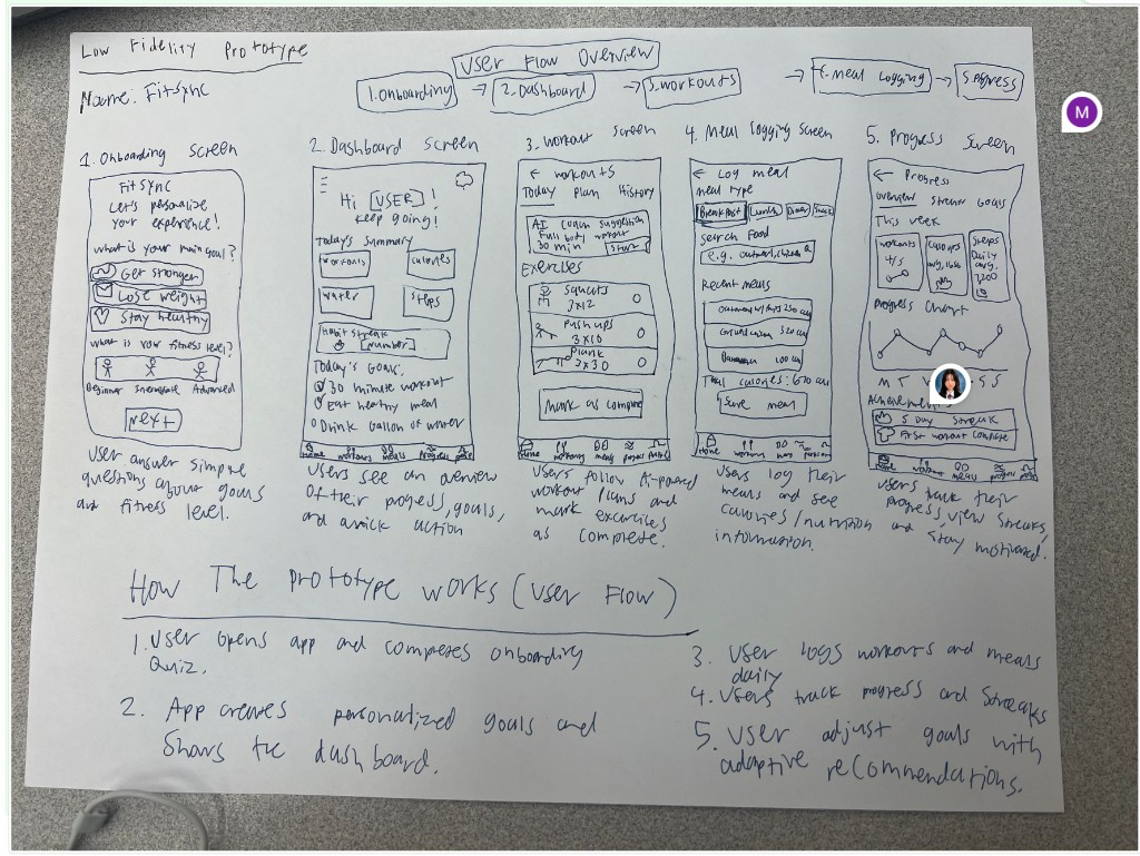
Low-fidelity sketch — FitSync's five primary screens and user flow overview
Storyboard
We created a storyboard to ground the design in a real user scenario — someone who is frustrated by cluttered fitness apps discovers FitSync, starts tracking everything in one place, and notices genuine improvements in their eating habits and overall wellbeing.
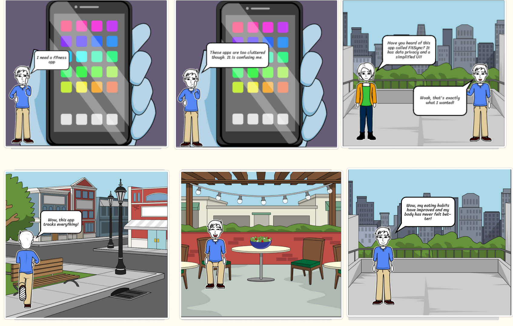
Storyboard — user journey from frustration with cluttered apps to improved health with FitSync
High-Fidelity Prototype
The high-fidelity prototype was built with a dark theme and a signature lime-green accent. It covers the full user flow: a guided onboarding (goals → fitness level → confirmation), the home dashboard, workouts, meal logging, and progress tracking. Scroll horizontally to step through the screens.
fitness goals?
fitness level?
Level: Intermediate
High-fidelity prototype — full app flow from onboarding through workout and nutrition tracking to progress
Why we built it this way
Why a dark theme with a lime-green accent?
The dark interface reduces visual fatigue for users who check the app multiple times a day — particularly during workouts or late-night meal logging. The lime-green accent creates a high-contrast, energetic highlight that draws attention to primary actions (Start Workout, Log Meal, Complete) without cluttering the background. This choice was directly informed by the affinity map insight that "simple UI is critical — too much data confuses users."
Why a guided onboarding quiz?
Our literature review (paper #1) showed that having personal long-term goals was the single most important predictor of whether someone actually sticks with a tracking app. The onboarding quiz — asking about goals, fitness level, and habits before showing any data — ensures the app is immediately personalized rather than generic. It also sets user expectations: this is your space, shaped by your answers.
Why a bottom navigation bar with labeled icons?
The user journey map revealed that nav labels were unclear between sections in earlier iterations, causing users to feel lost when navigating between workout tracking and progress. We switched to a persistent bottom nav with both icons and text labels to eliminate ambiguity. This directly addresses the pain point identified in Phase 2 of our journey map and aligns with the "simple UI" priority from research insights.
Why connect workouts, meals, and goals on one dashboard?
Research paper #4 (the Fitbit/Jawbone study) found that users stopped caring about their data when they couldn't connect it to anything meaningful. By surfacing workouts, calorie totals, streaks, and goal progress on a single dashboard screen, we remove the friction of navigating between siloed sections. The connection between the data and the goal is always visible, which is the core of what FitSync is designed to deliver.
Why a privacy control center?
The affinity map showed that trust and privacy were two of the most significant barriers to adoption. Users explicitly wanted control over their data storage (online vs. local) and didn't want their information sold to advertisers. Rather than treating privacy as a back-end concern, we made it a visible, user-facing feature. This signals to users that their data ownership is a first-class design priority, not an afterthought.
Why adaptive goals instead of fixed targets?
Research paper #3 showed that dropout rates remain high even in apps with goal-setting features, because those features don't adapt to the user's actual progress. Static goals become demotivating as soon as life changes. FitSync's adaptive goal system lets the AI coach suggest adjustments based on logged behavior, keeping the targets realistic and personally relevant rather than arbitrarily fixed.
User Journey Map
The user journey map was a central tool in shaping our design decisions. It revealed the emotional arc across four phases and surfaced concrete pain points that we translated directly into design opportunities.
- No onboarding flow or tooltips for first-time users
- Unclear where to start or what to do
- Some buttons too small and easy to miss
- Nav labels unclear between sections
- Workout history page is hard to locate
- Editing workout goals is unclear
- Calorie section needs clearer labels and context
- History is hard to find and read
- Add a short guided onboarding flow with tooltips
- Increase button size and add text labels to all icons
- Clarify nav section labels throughout
- Surface workout history directly on the dashboard
- Add an inline edit button for goals
- Redesign calorie section and add a visible history tab
User journey map — feelings, pain points, and opportunities across all four interaction phases
Pain Points → Design Decisions
- No onboarding flow → guided quiz with tooltips for first-time users
- Buttons too small, nav unclear → enlarged touch targets, labeled bottom nav
- Workout history hard to find → history surfaced directly on dashboard
- Editing goals unclear → inline edit button with clear affordance
- Calorie section confusing → redesigned with clearer labels and a visible history tab
Trade-offs We Accepted
- Dark theme reduces battery life on OLED screens but was prioritized for usability
- Simplified feature set means power users may want more depth — we accepted this to serve beginners
- AI suggestions require server-side computation, which adds latency — offset by clear loading states
- Privacy-first local storage makes cross-device sync more complex
Testing the design
We conducted two rounds of usability testing using an A/B testing approach — comparing a gamification-focused version of FitSync against a more passive, positive-reinforcement strategy. Testing was performed with peers from other design groups who had no prior exposure to our prototype.
Round 1 — Testing Group 2
Purpose & Method
To find out whether real users can understand and use the interface as intended — without us explaining it to them. We wanted to see where people got confused, what they missed, and whether our design assumptions held up when someone who was not involved in building it tried to use it. Method: A/B testing comparing gamification vs. passive strategy.
Tasks Given
- Navigate through the core user flow without guidance
- Determine whether the gamification elements made the app more motivating or distracting
- Assess whether the user flow is clear from screen to screen
Breakdowns Found
- Unclear interfaces in several key screens
- Lack of integration with non-fitness goals — the app felt too narrowly focused on exercise
- The broader vision of bridging fitness wearables with daily goal-setting tools (like Notion) was not coming through in the prototype
Change List
- Make interfaces clearer and more legible
- Add clearer integration pathways for non-fitness goals
- Reduce bias toward purely fitness goal-setting — the app should serve broader personal habits and milestones
Round 2 — Testing Group 4
Purpose & Method
To validate whether the user flows make sense to someone encountering the prototype for the first time. We also wanted feedback on whether gamification or positive reinforcement (even when users miss their goals) resonates more as a motivational approach.
Tasks Given
- Walk through the user flow and assess whether navigation is intuitive
- Compare gamification features vs. passive positive reinforcement
- Identify any missing screens or gaps in the prototype
Breakdowns Found
- A few missing screens in the diagram — specifically for starting individual exercises
- No graphic or step-by-step instructions shown when an exercise is selected
- The jump from selecting a workout to performing it felt abrupt
Change List
- Add exercise detail screens with a graphic and written instructions for each exercise
- Make the prototype more comprehensive and consistent with our overall design principles throughout
What Worked Well
Round 1
- The A/B structure gave testers a clear frame of comparison — feedback was more specific than in open-ended walkthroughs
- The overall concept resonated: testers understood the value proposition of a consolidated tracking hub without explanation
- The onboarding flow was described as a good idea — testers appreciated the personalized setup before entering the main app
Round 2
- The high-level user flow (onboarding → dashboard → track → progress) was understood intuitively by all testers
- The dashboard layout was praised for surfacing the most relevant information at a glance
- Positive reinforcement framing (not penalizing missed goals) was preferred by most testers over strict gamification
Key Learnings from Evaluation
- Scope clarity matters. Both testing groups noticed that the prototype leaned too heavily on fitness tracking alone. The design needed to more visibly support the original premise: bridging wearable fitness data with broader daily goal-setting.
- Completeness signals trust. Missing exercise screens made the prototype feel unfinished, which undermined users' ability to assess the full flow. Every dead end in a prototype plants doubt about the overall design.
- Gamification is context-dependent. User feedback was split — gamification worked well for some users as a motivator, while others preferred the gentler positive reinforcement approach. The final design incorporated both: streak tracking for users who respond to gamification, and adaptive encouragement that doesn't penalize missed goals.
- The A/B method revealed preference differences we wouldn't have found otherwise. Running two conditions in parallel surfaced a genuine tension in user expectations that a single prototype test would have missed.
What we learned
Design thinking is iterative, not linear
We came into this project expecting a clean progression from research to design to prototype. In reality, every prototype iteration sent us back to the research. The user journey map revealed pain points that hadn't come up in any of our earlier affinity mapping, which meant redesigning navigation twice. That back-and-forth felt like setbacks at the time but produced a much more honest, grounded design.
Privacy is a design problem, not just an engineering one
We initially treated privacy as something engineering would handle after we finished the UI. Our research changed that view. Users in every study we read flagged privacy and trust as primary reasons they stop using apps. Making privacy visible and user-controlled — not just present in a terms-of-service page nobody reads — became one of the most important design decisions we made.
Simplicity is much harder than it looks
Every team member came in with a feature they wanted to include. The harder discipline was cutting features, not adding them. Research consistently showed that feature richness causes abandonment, not engagement. Learning to justify every element on the screen — and argue for removing things — was one of the most practically useful skills we developed during this project.
Low-fidelity prototypes do real work
We spent more time on the paper prototype than we expected to, and it paid off. The paper sketches forced us to agree on information hierarchy and screen structure before any visual design decisions were made. Arguments that would have been expensive to resolve in Figma — where does meal logging live? what's on the home screen? — got resolved on paper with a sharpie.
What we would do differently with more time
We would invest more in user testing with actual beginners — our primary target audience. Most of our feedback came from peers who are already comfortable with fitness apps, which may have made us underestimate how much guidance first-time users need in the early sessions. We would also spend more time on the AI coach interaction — it's currently a feature in name, but the conversational design behind it deserved much more attention.
Where the design falls short
Current Limitations
- Assumes smartphone access. The design is mobile-first and doesn't account for users without smartphones or reliable data connections.
- AI suggestions are under-specified. The prototype shows AI recommendations as a feature, but the underlying logic — what data it uses, how it learns, when it intervenes — is not yet designed.
- No wearable integration. Despite being inspired by the fragmentation of wearable data, the current prototype doesn't actually pull data from WHOOP, Fitbit, or Apple Health.
- Limited accessibility testing. The dark theme was not tested with users who have visual impairments or color blindness.
- Privacy controls are UI-level only. The privacy center shows controls to users but doesn't reflect a real backend data architecture — the full implications of "local storage" vs. "cloud storage" were not designed through.
Future Directions
- Wearable API integration. Connect to Apple HealthKit, Google Fit, and WHOOP API so data flows in automatically rather than requiring manual logging.
- Genuine adaptive AI. Build out the actual recommendation logic — using logged workout and meal data to suggest when to rest, adjust calories, or change goal targets.
- Accessibility audit. Run a full WCAG 2.1 audit and test with users who have visual or motor impairments before any production release.
- Social and accountability features. Research suggests accountability to others significantly improves habit formation — a lightweight social layer (shared streaks, optional progress sharing) could address this without becoming a social network.
- Longitudinal usability study. Test retention over weeks, not just initial sessions. High dropout is the core problem we set out to solve — a short usability test can't validate whether we actually solved it.
References
- Lupton, D. (2021). How self-tracking and the quantified self promote health and well-being: A systematic review. Journal of Medical Internet Research, 23(9), e25171. https://www.jmir.org/2021/9/e25171/
- Li, X., et al. (2023). Examining the impacts of fitness app features on user well-being. Information and Management. ScienceDirect. https://www.sciencedirect.com/science/article/abs/pii/S0378720623000447
- Ng, K., et al. (2024). Analysis of training behavior in users of a fitness app: Cross-sectional study. Journal of Medical Internet Research. NCBI / PMC. https://www.ncbi.nlm.nih.gov/pmc/articles/PMC12828317/
- Asimakopoulos, S., Asimakopoulos, G., & Spillers, F. (2017). Motivation and user engagement in fitness tracking: Heuristics for mobile healthcare wearables. MDPI Informatics, 4(1), 5. https://www.mdpi.com/2227-9709/4/1/5
- WHOOP. (n.d.). How the Whoop Strap uses recovery science to drive habit change. WHOOP Blog / Performance Research. https://www.whoop.com/the-locker/whoop-strain-recovery-science/
- Wolfe, J. (2020). The quantified self movement and personal informatics. MIT Technology Review. https://www.technologyreview.com/2020/10/15/1009670/the-quantified-self/